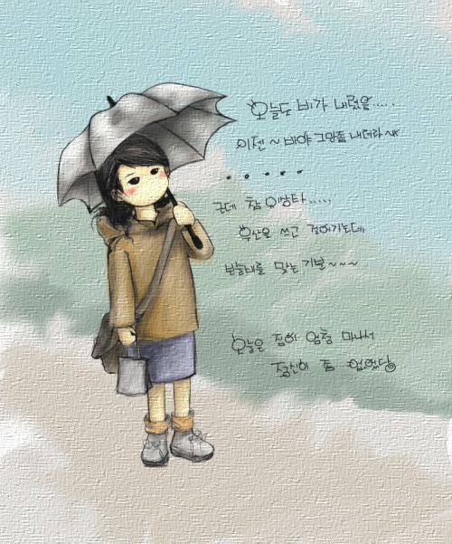
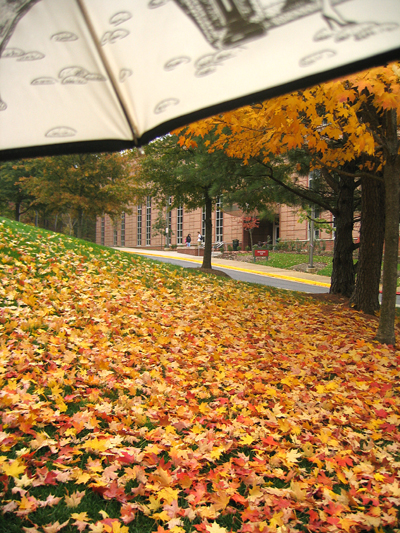
last Friday... right outside of Fine Art Building... after the meeing~^^~ it was raining lightly and the view was soooooo beautiful~ 
posted by darjeeling @ 3:14 AM
0 comments
![]()
funny... tea lover...

last Friday... right outside of Fine Art Building... after the meeing~^^~ it was raining lightly and the view was soooooo beautiful~
posted by darjeeling @ 3:14 AM
0 comments
![]()
It was very interesting to know some of formal and modern printmaking processes after reading some of articles on William Blake. Trying to understand how the process went was not an easy thing, however, I luckly experienced the actual process previously from the digital printmaking class. I had used bottom sheet to register plate to the paper and it wasn't easy since the plate easily moved when it went under the roller. And inking up the plate was especially hard for me.....!!! Obviously, I wasn't good at it but I now think that it was worth of experience and extremely helpful for me to follow the articles by Michael Phillips, Robert N. Essick and Joseph Viscomi.
posted by darjeeling @ 2:27 AM
0 comments
![]()
An image from a picture book, A diamond of 10 power, by Ichirou Senoo
In the process of searching for an image that grabbed my attention and stopped me from moving into other pictures, I found a picture book called A diamond of 10 power by Ichirou Senoo. The book consists of many pages of paintings that tell stories without any words. Ichirou’s imaginations are not direct but they can be understood with the help of readers’ own creative imaginations. The effect of the paintings on the reader is warm, calm, and comforting. I chose the image that most infatuated me from a large selection of paintings. As I looked into the image more, I was able to see beyond the surface and that stirred my imagination. I wanted to describe what I had imagined and observe other readers’ reactions to my ekphrasis. The poetic approach that I used to illustrate the painting seems adequate after having done the image reconstruction workshop, however, it also showed me that there are various appropriate ways to illustrate art.
The painting I chose by Ichirou Senoo is representational; it consists of fathomable objects in rich colors, creating a perception of deep space. I attempted to describe these objects considering iconographical, interpretational, and compositional aspects. I tried to explain the white spots or the circles on the picture as I interpreted them; I do not know what they represent but I used my imagination. This is shown in my ekphrasis where I said, “Thousands and millions of wee white lights that resemble featherweight soap bubbles, diamonds of the first water, or even lights as faint as the glow of fireflies are floating all around the space.” I continued the description of these white spots, by saying in paragraphs three and four: “Here, dusky red and blue lights seem to become raspberries and blueberries enclosing the aperture.” The title of the picture book could lead one to assume that the white spots are diamonds but I did not limit my interpretation to the title alone. This strategy plays a part in the aforementioned iconographic descriptions.
I also attempted to tell the story by coming out with the possible theme, happiness. I interpreted the two children as they had journeyed through the tickets of thorn and discovered the land of imagination that was filled with happiness. These can be found in the fifth paragraph “Two children already had passed through the thorn thickets and they are now standing on the edge of a hill not far from each other.” Moreover, two blue birds from a fairy tale was indicated here to underline the theme further: “Two blue birds, which might symbolize happiness, are flying over the thorn thickets behind each child…. led the children to find their way out.” I have seen the painting as the fairy tale for grown ups which is being something like a drizzling rain for those with dry hearts.
The intriguing looks of the painting are not just limited to the contents but they are also extended further to the compositional aspects. Even though the vanishing point is in the center of the picture plane, which can be very boring to the viewer, the artist succeeded on creating the inviting enough, well balanced painting by mirroring approximately the right side to the left side of the frame. I pointed out this in the last paragraph as “Moreover, the image may even be folded in half to match left to right or vice versa. The image is perfectly balanced by first placing rainbows on each left and right sides, then children below these rainbow roots, and eventually, the blue birds behind the each child.” Because of this compositional fact, I think it is best for the viewer to stand in front of the center of the painting when one really wants to get involved in the moment shown.
After reading the delineations by Philostratus, Gertrude Stein, and Matt McGarraghy, I used the poetic approach to describe Ichirou Senoo’s painting. From reading these descriptions beforehand, I saw them as quite narrative poems. I illustrated Ichirou Senno’s painting in such a poetic way since I felt this was the decent way and not only because these other descriptions were delineated in such a way. In Andrians by Philostratus, there are sundry depictions of an unseen painting that aids me to picture in my head. Such one among several is “The river lies on a couch of grape-clusters, pouring out its stream, a river undiluted and of agitated appearance; thyrsi grow about it like reeds about bodies of water… some are drunken and dancing.” Matt McGarraghy also approached to his description of the painting, The Glass Day, in a similar way. Here, for example, he illustrated the pregnant girl as “She is like a kangaroo with a joey but the pouch is sealed,” and the cliff and its reflection as “Why climb the cliff when you can be at one with it all at once by jumping into the reflection which is so clear. So clear that, if held upside down, one would soon not realize it save the blood rushing to the head.” Matt described the painting in so touching and enjoyable ways and I tried to do mine with such an overture to create the pleasant, imaginative picture in the reader’s heads.
I also tried simultaneously to give some spatial information thus it would not be so hard to position the contents in the reverse ekphrasis, whereas, the placement seems somewhat ambiguous in Matt McGarraghy’s image description. The reverse ekphrasis on Matt’s work by Emy Kanashiro clearly shows such lacks of compositional aids. On the other hand, the plate illustration of the Infant Joy by the Blake Archive team presents structural representations. The Information on the way some of objects are placed in the corners of the painting, in relation to the rest of other objects, is given pretty clearly. To remark such example would be “The greater stem curves left—between the grass and the text—and then up the left margin.” Although I focused more on the poetic description of the painting, I sought correspondently to give some aforesaid structural information.
During an image reconstruction workshop, I read other image descriptions by classmates and that experience made me to realize that not everyone took the poetic approach. Rather, some of them use more analytical approach considering historical background of the period of the work that was created. When I read Jill Pichoki’s image description, I could envision more than just a possible visionary image. In a historical view, I was able to imagine what would it been at the time of the photograph was taken. Furthermore, it told me to see beyond such as the relationship between the subjects of the photograph and the photographer who was not shown in the picture. By talking about this fact, Jill extends her description to the outside of the picture plane, the detail I thought most fascinating. She talks emotions of three main characters, father, mother, and daughter, as friendly in relation to the photographer who possibly could be seen as an outsider to them. It was very pleasing and made me to realize that there are many other ways to describe art.
An image reconstructed from my description of Ichirou Senoo’s painting resembles the original painting to quite a degree. The placement of the main objects is nearly correct and the resultant atmosphere or emotional response created is similar. Nevertheless, there are still some differences such as the way the blue birds face each other and the way the children both stand in the left side of the frame. Moreover, unlike the original painting, an image that seems to represent the sun is right above the vanishing point in between two rainbows. The colors do not get darker around the edge creating a black frame, as they do in Senoo’s painting. The reconstructed image, the reverse ekphrasis, reveals that my original description was not very clear about illustrating the states and the contours of things. For example, my description was not detailed enough to show the conspicuous postures of the blue birds. To give a better understanding to the viewer, appending technical information would have been good, such as the bush strokes, the directions of them and how these affect the painting as a whole. I also should have mentioned the medium that was used to create the painting.
posted by darjeeling @ 3:27 PM
0 comments
![]()
The impractical painting shows an image of wonders that anyone might has in one’s mind and not in one’s head. It is almost like the painting has been created by the sum of those wonders that have drifted in the air. Two numbers of each rainbow, child, and blue bird play important role in three different placements of the painting, creating a well-balanced composition with the vanishing point in the center.
Bright, dreamy landscape is spread over the horizon with two rainbows on each side, one heading toward left while the other one heading toward right. They are not like mediocre rainbows but much richer in quality and heavier in weight. Instead of consisting the vivid seven different colors, they emit variable gold colors that are caused by richness of earth underneath and pureness of air. The earth itself emits dazzling radiancy outward, which is even more blinding than the sun and clearer than sky.
Thousands and millions of wee white lights that resemble featherweight soap bubbles, diamonds of the first water, or even lights as faint as the glow of fireflies are floating all around the space. However, these lights become dull, turning into dark red and blue colours that are not as bright as the center section of the picture. They becomes dull as they get far away from the rainbows roots and come closer to the thickets of thorn close to the edges of the picture.
The thickets of thorns operate as a hedge to this visionary land emphasizing the preciousness of the place by not being an easy access. These thickets also work almost as a grotto by showing the dreamy landscape in the center of the image and gradually shifting colors to black toward all around the edges. The world seems to be shown through an opening of a grotto from the inside to the outside. Here, dusky red and blue lights seem to become raspberries and blueberries enclosing the aperture.
Two children already had passed through the thorn thickets and they are now standing on the edge of a hill not far from each other. A girl and, standing to her right, a boy, who only show their backs, are looking down the hill and quite surprised by the unspeakable, magnificent spectacle. The girl with short hair that barely touches her shoulders is opening her arms wide as if it is possible to hold this otherworldly place. The boy, who is about three inches shorter than the girl, is reaching out his left arm to grab drifting white lights. Due to the refulgence of the middle foreground, it is hard to make out the children’s characteristics. Only their silhouettes provide an idea of the children’s size and shape.
Two blue birds, which might symbolize happiness, are flying over the thorn thickets behind each child. The blue bird on the left faces the bird on the right, in turn, the bird on the right gazes out to the same place as the children. They seem to live in the thorn thickets, echoing blue and red colors of berries on their feathers, and had led the children to find their way out. The light shimmers off their wings softly, also emphasizing the smoothness and roundness of their bodies. In contrast, the dramatic shift of light on the thorns and the aperture of the grotto accentuate their surfaces’ roughness and flatness.
The strong contrast between foreground and background, along with powerful lighting, characterize the whole image and evoke a daydreaming touch. There appear to be three spatial places, front, middle and back. The front space is an opening of the grotto with the blue birds that works almost like a flame for the image. The middle space is taken by two children who seem to mirroring anyone with such inner desire for the happiness. Lastly, the background is the dreamy landscape with two golden rainbows and endless field behind, emphasizing depth. Moreover, the image may even be folded in half to match left to right or vice versa. The image is perfectly balanced by first placing rainbows on each left and right sides, then children below these rainbow roots, and eventually, the blue birds behind the each child.
posted by darjeeling @ 3:21 PM
0 comments
![]()
Free Culture Remix
Artist Statement
Painters use paints, often mixing and remixing various colors to create new colors, which are to be applied on canvases. Resultant colors will be already known to the world and probably will even have names or specific numbers to them. However, these consequent colors could be something that came out casually by applying little bit more of, for example, white or yellow to green paint. It’s kind of hard to come out with always-same exact colors every time a painter mixes different colors on a palette. Surely, it might look almost same to most people but still will not be 100 percentages same since human eyes can’t catch that minute differences so well. Yet, to look at the colors in a broader sense as, for example, twelve standard rainbow colors rather than going so deep into varying shades of each of these colors, there are limited numbers of colors that human eyes can distinguish from light and so artists are using and sharing same colors to represent often similar things. Nevertheless, we cannot say that they are stealing others’ ideas on how one have used colors to represent resembling things.
Maybe there really is nothing that can be said as original in the world, just as Lawrence Lessig commented in “Free Culture.” Thus, the concept and the view of colors on how they have been used to represent certain things could be seen as unoriginal. However, it still at least will be seen as a creative tool by which we are able to struggle to create something new in the future theoretical view. There is nothing new, original or creative in present time and reusing ideas from past could be seen as just repeating what had been done before. Nevertheless, as everybody will know, these repeated works are not that same from previous works just as mixing colors wouldn’t be exactly same from previously mixed colors. Going back to history and inspired by past ideas will help to create similar but definitely different work and in this sense, the new work is creative since it came out with different result from the same source. Using colors that all others also use could be said as not unique, yet it is very fun to see how one expressed more significant feelings than others by using the same tool called color. So the color is a method that gives chances and possibilities to us, reopening our imagination. Moreover, this tool is actually composed of many invisible ideas, words, languages, etc. which are swirling all together as components of paint that exist similar to atoms. Whensoever painters mix different colors in a paint bucket, they also unconsciously mix and apply these invisible components on the canvas. So in other words, every artist are using same tool, same components, to make creative works of art and because of this above reason, process is hard but not impossible. We just need to paint and reorder the invisible ideas on the canvas until we success. We only need to revolt by grabbing something out of a deep hole that leads to the past through the paint method, since so-called components of paint are transparent creative elements that are waiting to be noticed again.
After reading the “Free Culture” by Lawrence Lessig, I created a derivative two-dimensional digital image that suggests about invisible components of paint and necessity for connection to the past, and I depicted this notion in an abstract way. Overall image of strong colors represent mixture of different paints and the center black image stands for some kind of a hole that leads to the history. It is a black hole that has sucked all the creative sources and there is a big need for eruption.
It wouldn’t be possible for me to create this derivative work if Lessig hadn’t waived some of his copyrights since I took some of his writings from the book. But would it make any difference if I made those quotations harder to recognize, either by lowering the opacity or breaking up words. Would it be more of “fair use” than non-regulated use of the book? It’s so complex for me to decide.
Image is posted on the web Components of Paint
posted by darjeeling @ 11:31 PM
0 comments
![]()
For two days I've been reading "Languages of Art" by Nelson Goodman and I only read about five pages till now. Not only it takes really a long time for me, I don't even understand what he is describing or meaning by syntactic,inscriptions, scores, marks, etc. How difficult it really is.....T.T
So, I checked if there is a translated version in Korean by any chance. And luckily, there was!!! And I was able to buy the file. Nevertheless, it was even much more hard to understand!!!!! Funny thing is that I don't think the translator did a very good job on it. There were few places where she translated wrong that even I could notice that. But I don't think it is a bad version since the book is not easy reading from the first place and putting in different language just made it more hard to understand.
posted by darjeeling @ 12:11 AM
1 comments
![]()
I was listening to the sound track of Lion King and I suddenly thought about Lawrence Lessig's talk on Walt Disney in "Free Culture." I remembered the time I first saw the movie "Lion King" several years ago. I was quiet surprised by the story since it was very similar to the animation I used see when I was very little in Korea. There was a Japanese animation called something like "Prince Leo in the Jungle." I wondered how it could be so similar to each other and shortly after, I read an article talking about this issue. I think the article said Japanese company that produced "Leo" brought up the issue against Walt Disney saying that Disney copied their story and ideas. However, Disney said they didn't and it was their own idea. I know nothing more than that since I wasn't that much interested in it at the time. After reading "Free Culture" and having discussions in class, it feels funny to see how those two animations were very similar to each other in almost every aspects and still can be claimed as originals.
posted by darjeeling @ 1:25 AM
3 comments
![]()
There are a lot more meanings and views than I ever imagined on ideas of copyright. I thought that copying a simple idea from someone else, such as copying unintentionally the way one speaks or makes hand gestures, could be one of many piracy. Well, this example wouldn't really be considered as theft or violation of copyright, however there could still be an aspect of that depending on how one perceives it. Am I always stealing someone else's ideas, words, gestures, etc. to incorporate them into mine? As I read the Free Culture by Lawrence Lessig, I'm keep thinking about whether I am using other's stuffs again or not in every moment. Well... not every minute but often. When I am reading the book, I look up the dictionaries a lot since there are so many words that are new to me. And sometimes, I find some very useful or just very attractive. So I remember them and try to use them later whenever I am talking to someone or writing an essay. Here, I was just trying to learn English. But can it be also considered as using other person's very own word? I just thought this way for once while I was reading Lessig's opinions. I think I don't need to go that deep. Right?
posted by darjeeling @ 2:07 AM
1 comments
![]()
There are many search engines but I always use Google and Yahoo since these are a lot more comfortable compare to other ones that I am not so used to. However, even when I using these search engines to do some quick searches, I haven’t used the quotation marks. No wonder why I always had to spent lots of time on research. From the practice of using quotation marks, stop words, and trying using new search engines, I finally got some real idea of doing research in the web culture.
I’ve been using Google for several years, but I’ve never noticed that there actually is a big difference in results depending on usage of quotation marks since Google considered so much on classifying stop words in order to shorten search time and data bank space. When I tried “to be or not to be” without quotation marks, Google searched only for the word “not” and not for all other words. It said “to” and “be” are words that are very common and so were not included in my search. Also, lowercase "or" was ignored. Instead, Google recommended to try "OR" to search for either of two terms.” Most of the search results had nothing to do with the phrase “to be or not to be.” When “to be or not to be” was entered with quotation marks, Google mainly looked for the whole phrase “to be or not to be” without breaking them up. And the most results were according to what the phrase were popularly known for. I tried one more search here using “Edvard Munch.” For this one, whether it was entered with quotation marks or not, results for both were very similar since the name does not include any stop words and also, it is not that common name either.
In Ask Jeeves, results were similar from Goolge. For “to be or not to be,” it only looked for pages that contained the word “not” and not for all other words when it was entered without quotation marks. And when quotation marks were included, it then searched for the whole phrase. Here, Ask Jeeves was also ignoring stop words probably for the same reason as Google.
Mooter is a search engine that I used for the first time and I thought it is quiet interesting to see how they did the searching and categorized the results visually. “To be or not to be” came out with similar results whether quotation marks were included or not. And Mooter even gave an option to look the phrase in different categories. It did not ignore stop words and rather it considered the search term as a whole as if they were inside invisible quotation marks. However, it did not limit itself to that and continued to look for each words too. This way I didn’t have to do search twice to see the differences in usage of quotation marks.
AlltheWeb.com operates similar to Mooter by not relying on quotation marks very much and not ignoring stop word as much as Google does.
Some search engines ignore stop words while other search engines don’t, and these rather depend a lot more on usage of quotation marks. It is sometimes very convenient but not always. It seems like popular search engines, including Google, tends to pay little attention on importance of stop words. May be it’s because so many people are using it, which in turn causing it to store more sources and information, while lessening search time at the same time.
posted by darjeeling @ 2:03 PM
0 comments
![]()